Product Dashboard
Roles: User Experience, Visual Design, Data Visualization
The Bronto Marketing Platform was long due for a redesign. After tackling the header and navigation, the dashboard took next priority. I led the UX and visual design while collaborating closely with a dedicated UX researcher.
The Challenge
The Bronto Marketing Platform’s dashboard was under-utilized for one simple reason — it was displaying the wrong information. It needed an overhaul so that busy marketing professionals can work as efficiently as possible. The dashboard is the first thing users see when logging in and we need to provide the data most important to them.
The Research
The team’s UX researcher conducted a user survey to determine the value of each existing widget. Users were asked how often they used each widget. Of 28 available widgets, only 4 of them averaged a response of “sometimes,” none ranked higher than that. We also combed through previous user interviews to identify patterns of requested features — items that could potentially appear on the dashboard. Finally, we conducted internal interviews with stakeholders and professional services, who are a user persona.
The Process
Armed with the research above, we started to map out widgets and connected them to metrics and the level of data available to us. For instance, we knew we could track revenue performance at the site, campaign, message, and delivery level. Once we settled on the data within each widget, we began to whiteboard how a widget might look and behave.
Once we were heading in a solid direction, we created some large paper prototypes and presented our planned content to the product team. We were looking not only for confirmation in our direction, but also for any holes in our plan.
The Solution
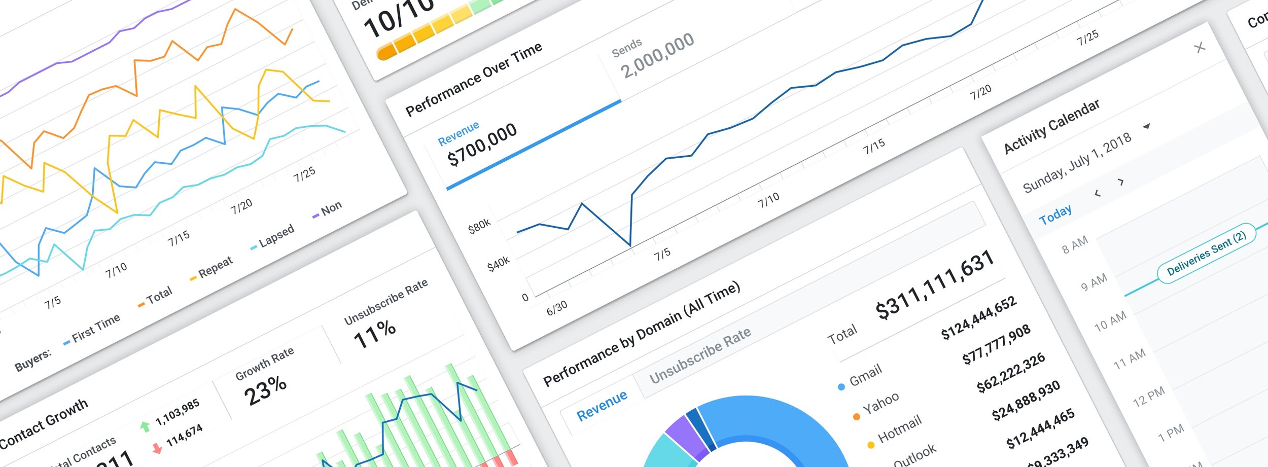
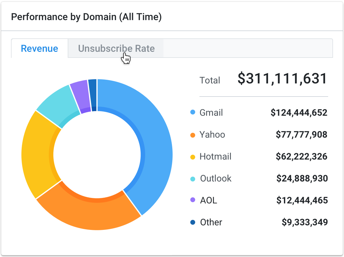
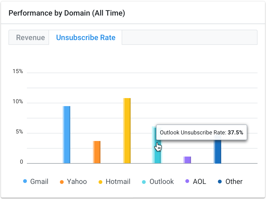
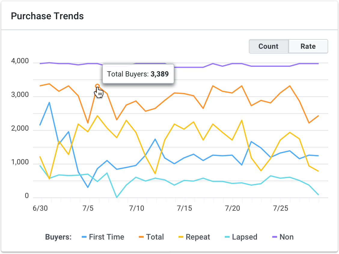
I worked in Sketch App to design a comprehensive dashboard including all of the functionality and data our users have been asking for — including trend data and a way to track growth. I then collaborated with the product manager and developers to size the work. From there, the PM and I focused on what would be feasible for an MVP. Shown are the MVP along with details of some of the widgets. The user also has added functionality to filter the data shown by a date range which we discovered was a large gap in the current dashboard.
Aside from widgets that better serve our users’ needs, the updated design also provides a better calendar system to schedule marketing emails and a shortcut to create new segments, emails and other common tasks.


