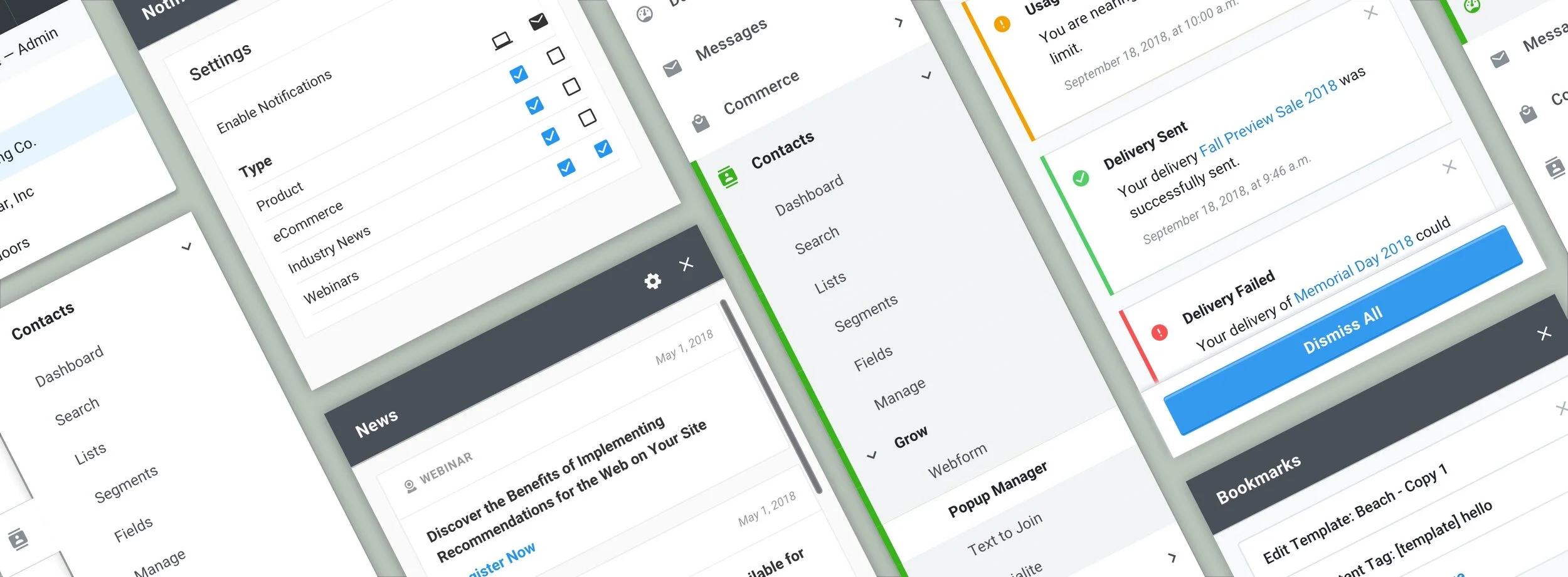
Navigation Redesign
Roles: User Experience, Visual Design
I began working at Bronto right at the start of a long overdue redesign. There was a plan in place to first implement a redesigned navigation and header for the marketing platform. This component touches every aspect of the platform and would lay the foundation for the rest of the redesign.
The Challenge
The decision to redesign the navigation and header first would not only lay the foundation for the rest of the redesign, but it would also make a powerful impact on for our users. Some frustrations that our users faced were overall findability, and awareness of where they are in the platform. Labels didn’t follow industry conventions making it difficult to locate items. For instance, there were main navigation items named “tables” and “apps”. Our goal was to restructure the IA and to provide a more efficient way to move around the platform.
The Research
Our lead user researcher led an extensive research effort to ensure our new information architecture made sense to our users. We needed to not only use industry standard words, but we also needed to group words the way our users expected. To accomplish this, our researcher conducted a card sorting activity with internal stakeholders and a Tree Jack exercise with external users. With the results from these activities, she was able to confidently develop a new organizational structure.
The Process
Once we were confident in the new IA, I developed a prototype using InVision. The prototype was tested with 8 users in which they were asked to perform a series of 9 tasks. The users successfully completed 8 of the tasks at a rate of 88% or higher. The ninth task was only successful 50% of the time. I went back to the design and iterated to achieve a higher success rate on the final task. I was also able to take some overall feedback and incorporate it into the design, such as more contrast in the hierarchy of the navigation and color scheme.
The Solution
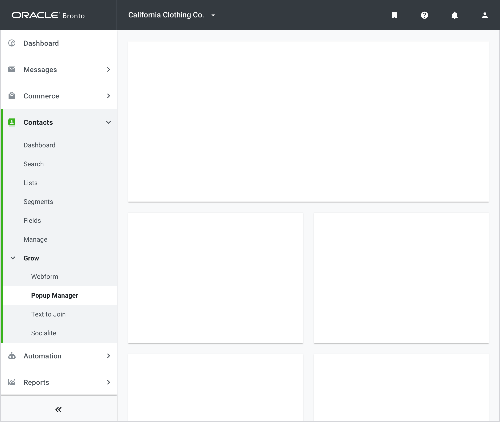
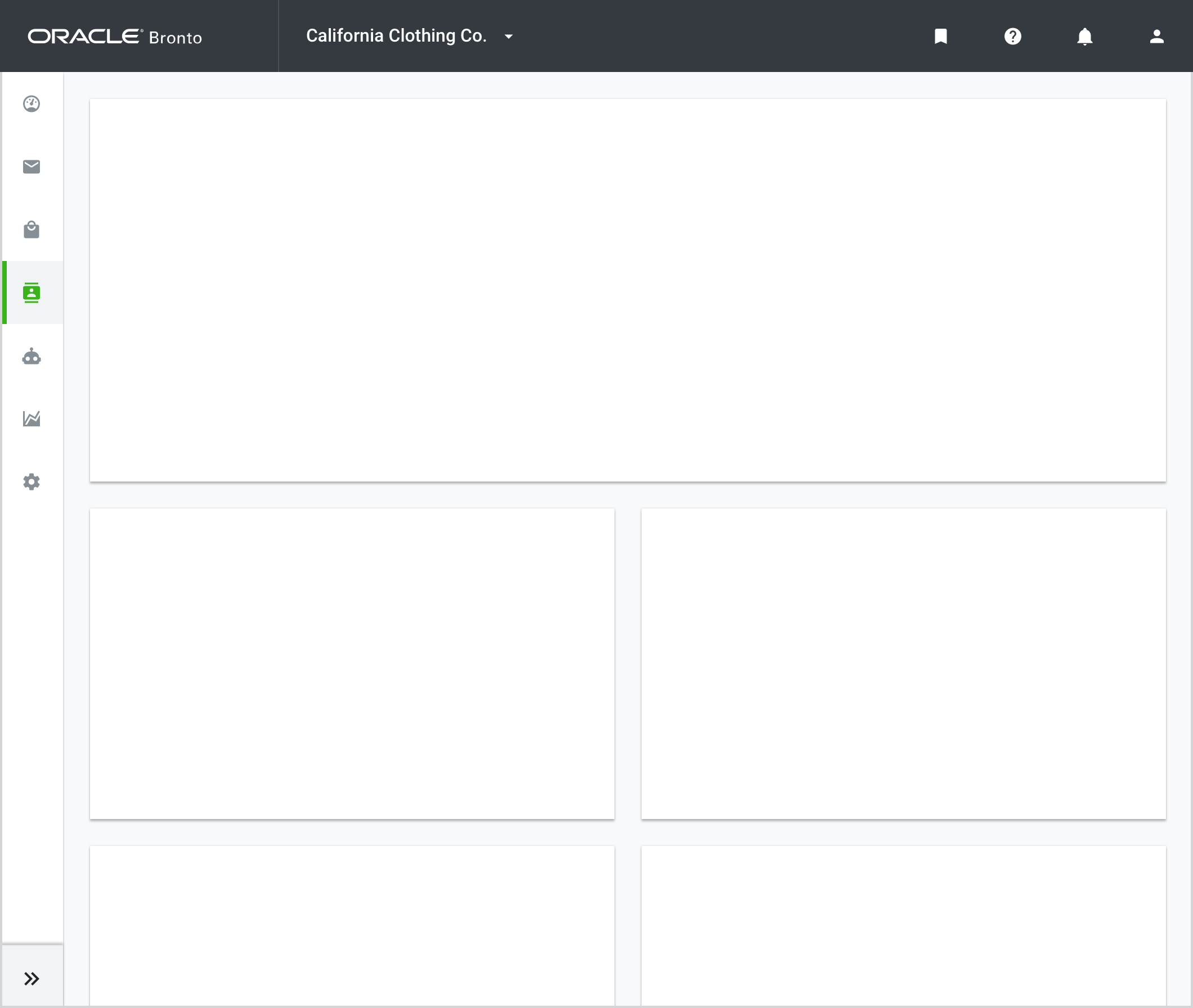
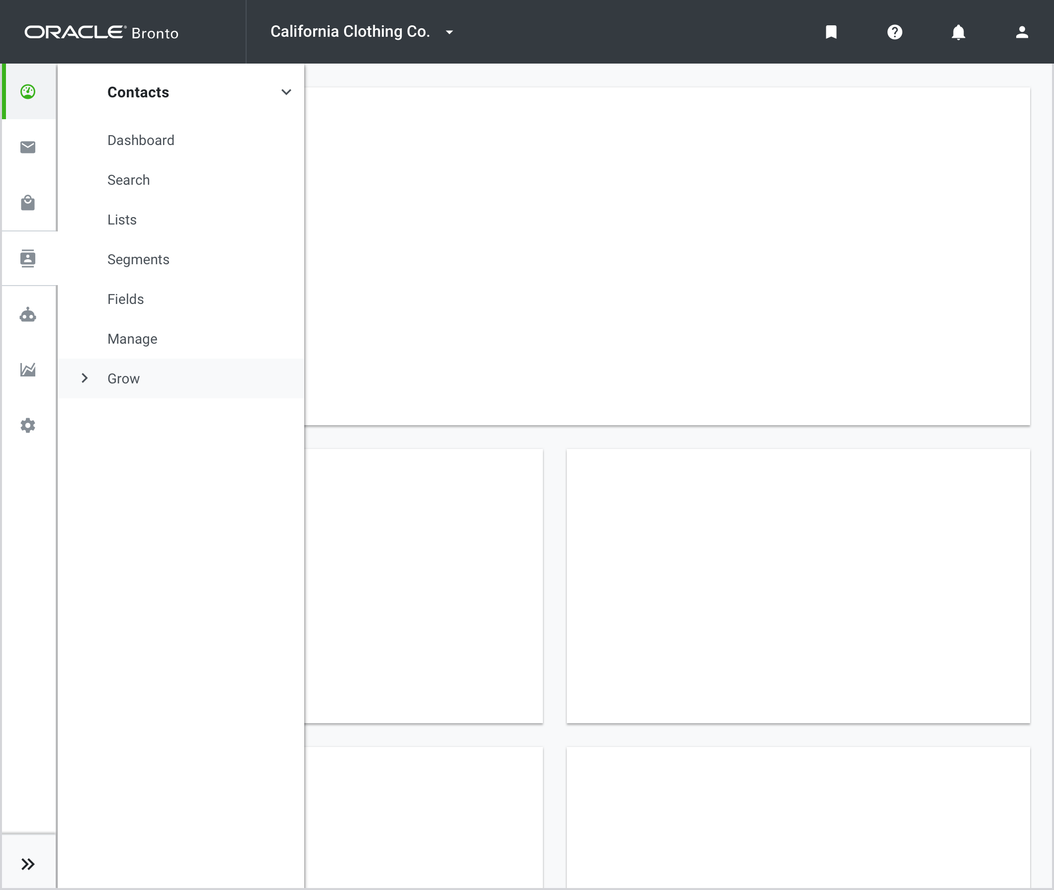
The final design for the new header and navigation utilizes the new IA and the results and feedback gained in user testing. The navigation items have been renamed and reorganized to make more sense for how our users interact with the product. I also moved the navigation from a top horizontal position to the left side which enables the platform to shift to a persistent navigation model. Now the user has insight into where they are in the product at all times. The side navigation also has a collapsing functionality which creates a larger work area in the platform. Other improvements made to the header include functionality to switch accounts, more entry points to find help, and improved visibility to platform notifications.


