Defining Critical Usage Patterns
HubSpot, 2026
During HubSpot’s design system modernization effort, the team decided to leverage a headless open-source library to accelerate development. By leveraging a third party library, it enabled those of us on the to focus on patterns — the real meaty problems in the platform.
Role
Staff Product Designer
The Problem
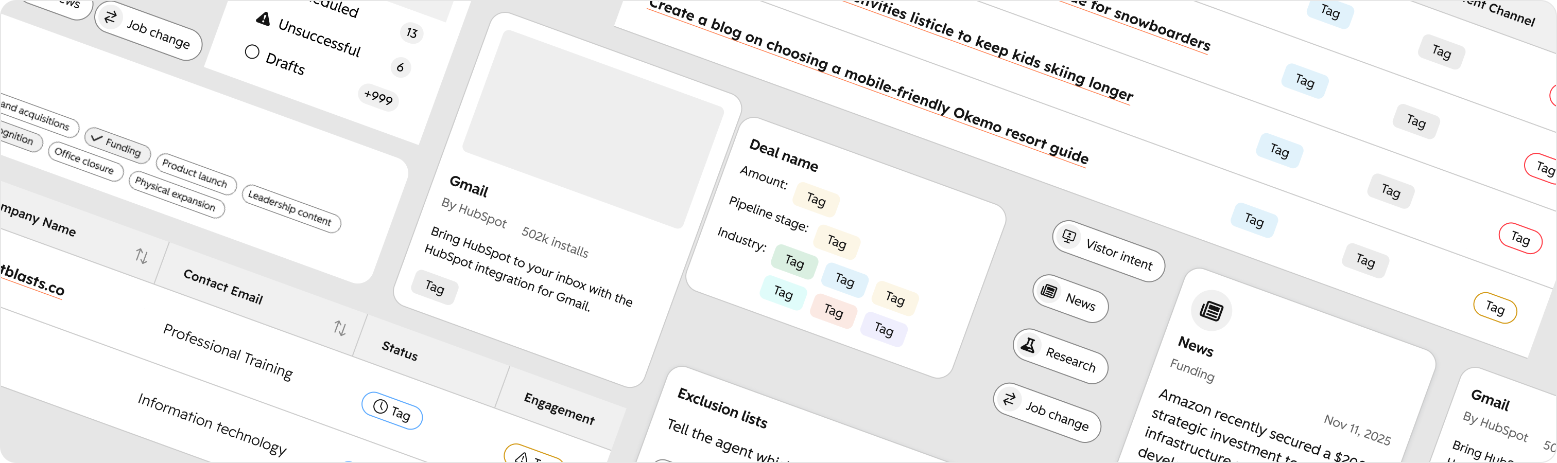
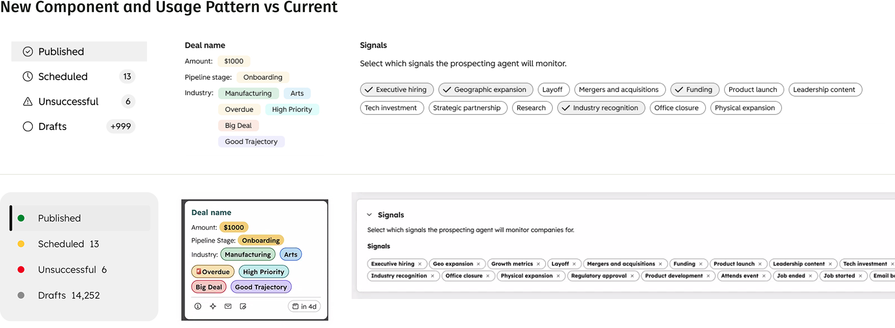
Little pill-shaped objects were randomly popping up all over the place, to the point that UX leadership was also taking note. Were they tags, were they chips? Product designers were pulling components out of an existing library and using them in different ways because they lacked clear guidance.
My Discovery Process
I started by going deep into other systems’ documentation. I really wanted to understand how other systems were defining tags, chips and badges. Was there a clear distinction or was this a gray area throughout the industry? I learned that the definition and pattern for badges was pretty easily defined and standard across the board. Tags and chips were a bit more of a mystery and most systems didn’t use all three. Does HubSpot have a need for all?
Auditing the Existing Platform
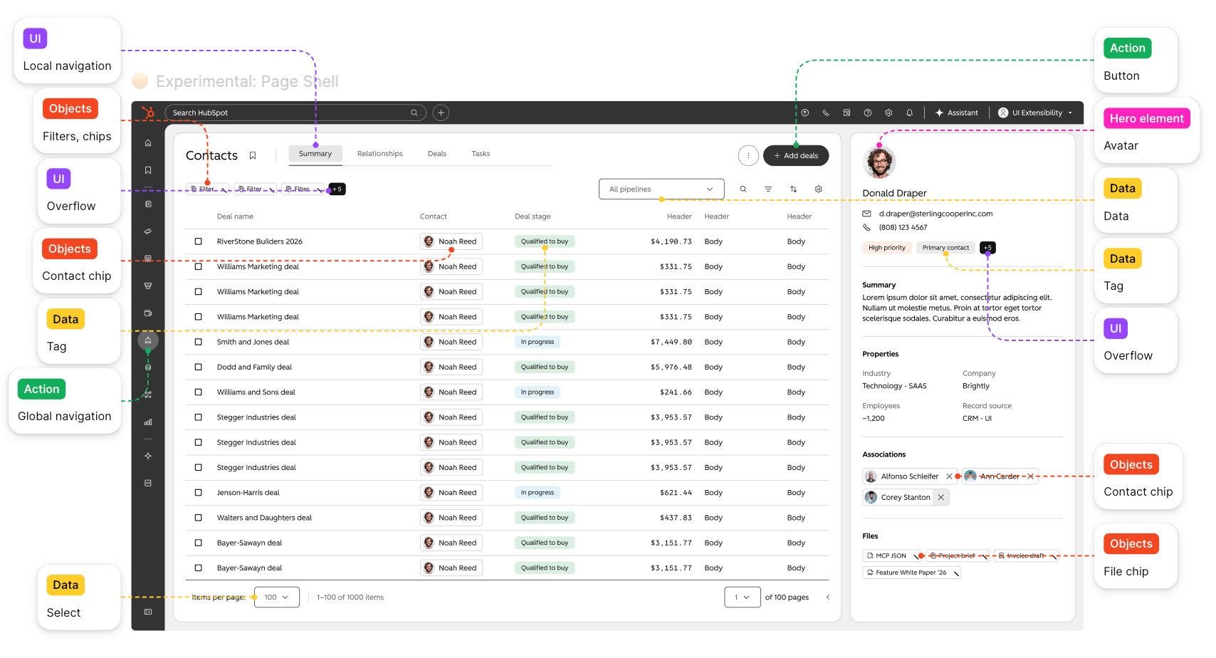
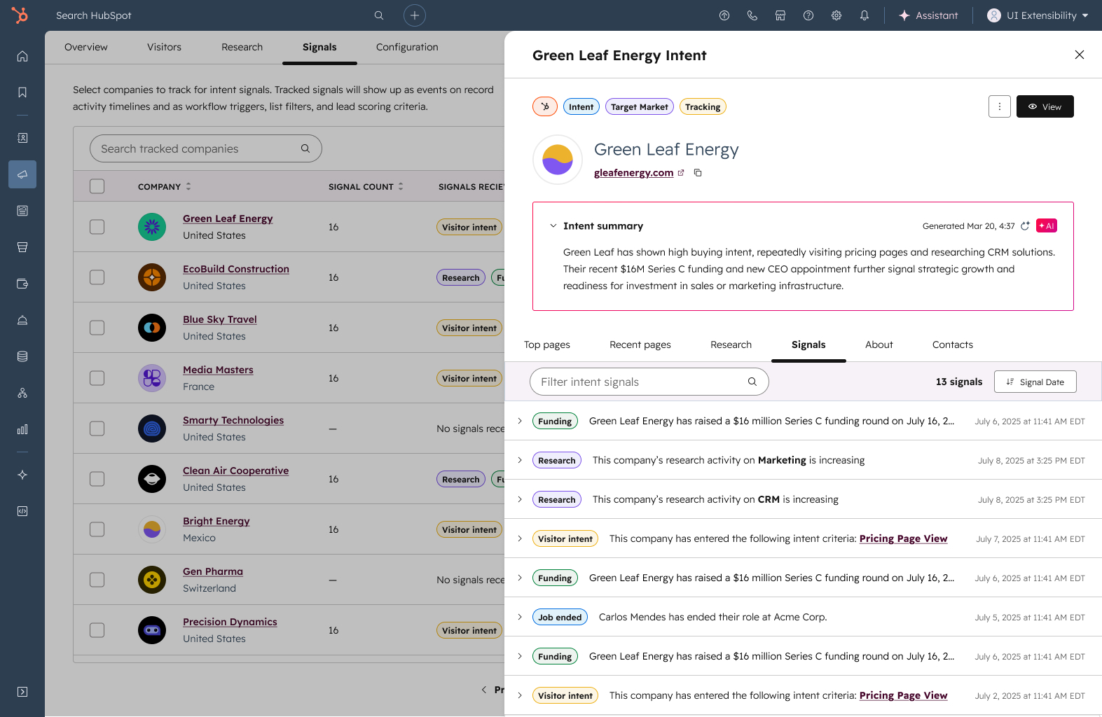
So I set out to learn more about why these were becoming so common in the HubSpot UI and what the actual use cases are. I talked to several product designers to learn about what they were trying to accomplish for the business and for the user. I also had discussions with them about what they perceived the definition of a tag, badge and chip to be. In many cases, designers were using the components interchangeably based on the visual design.
AI-Assisted Research
Through this research, I developed my own hypothesis of how the patterns could be defined. I felt confident in my hypothesis, but wanted to use AI to refine and validate my own findings.
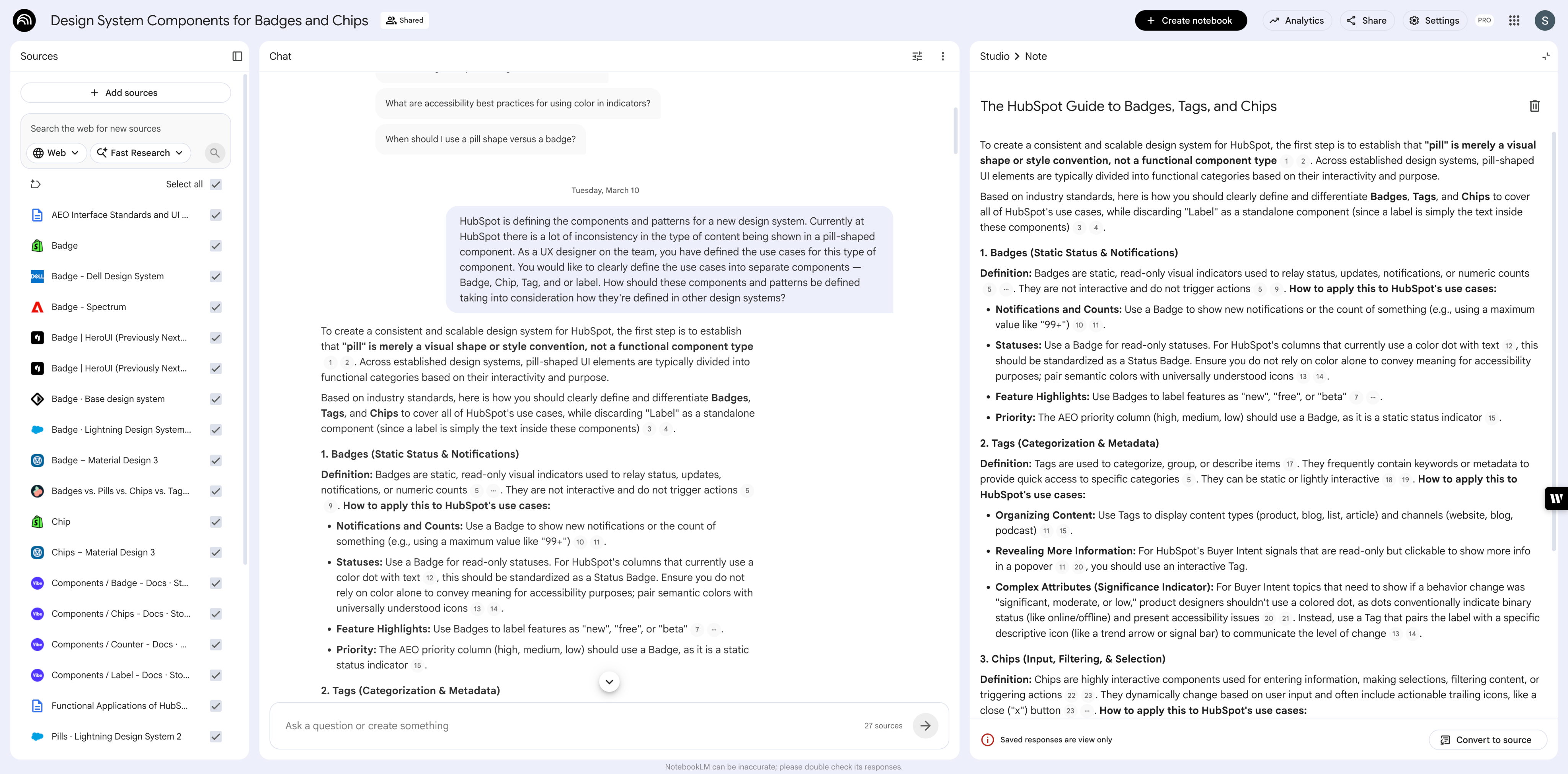
I used NotebookLM and supplied it with my artifacts — blog articles, external systems documentation, notes from user interviews. I prompted it by giving some detail about the ongoing work on the design system team and asked how the components and patterns should be defined. The results confirmed my hypothesis. After asking some clarifying questions, I was also able to add some optionality into how the components could be composed.
Component and Pattern Definitions
Badges are static, read-only visual indicators. They are used to relay notifications, numeric counts or status updates. They do not receive keyboard focus and are never interactive.
Tags are read-only, non interactive labels used purely to categorize metadata and group similar items. They visually organize and classify data.
Chips are highly interactive elements used to help users enter information, make selections, filter content or trigger contextual actions.
Applying Shape Language
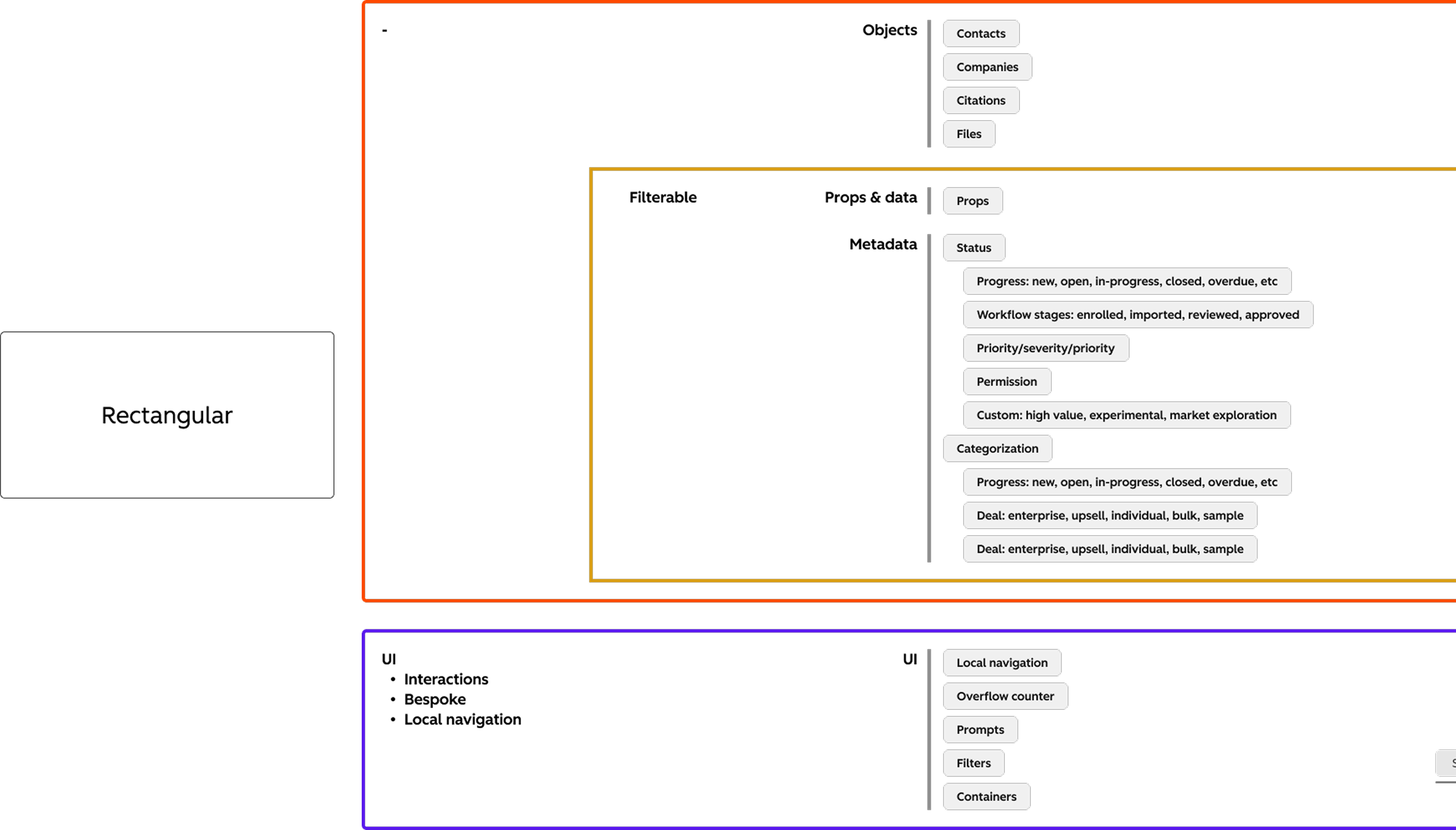
Defining chips, tags, and badges also helped the team push forward our shape language. These components add more context to our shape guidance. Rectangular items were used for objects—contacts, files, citations, companies—many of the things chips represented. They were also used for filterable metadata, things like status and categories—the definition of our tag component. Round shapes were for actions, but also to display system level information which is what our badges did.
Finalizing the Pattern
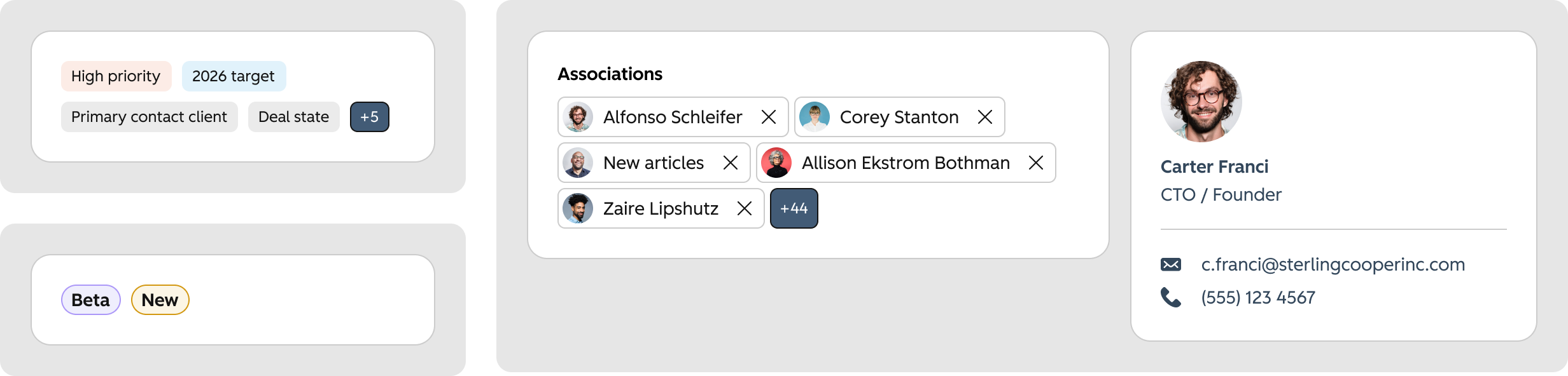
The result of this work was three distinct components with clearly defined patterns. I worked with our content designer to create a template for pattern documentation and I wrote out the pattern guidance for these three components. Our designers and developers now had the guidance they needed to use the components correctly and our end users now had a more consistent experience.

Defining Critical Usage Patterns
HubSpot, 2026
During HubSpot’s design system modernization effort, the team decided to leverage a headless open-source library to accelerate development. By leveraging a third party library, it enabled those of us on the to focus on patterns — the real meaty problems in the platform.
Role
Staff Product Designer
The Problem
Little pill-shaped objects were randomly popping up all over the place, to the point that UX leadership was also taking note. Were they tags, were they chips? Product designers were pulling components out of an existing library and using them in different ways because they lacked clear guidance.
My Discovery Process
I started by going deep into other systems’ documentation. I really wanted to understand how other systems were defining tags, chips and badges. Was there a clear distinction or was this a gray area throughout the industry? I learned that the definition and pattern for badges was pretty easily defined and standard across the board. Tags and chips were a bit more of a mystery and most systems didn’t use all three. Does HubSpot have a need for all?
Auditing the Existing Platform
So I set out to learn more about why these were becoming so common in the HubSpot UI and what the actual use cases are. I talked to several product designers to learn about what they were trying to accomplish for the business and for the user. I also had discussions with them about what they perceived the definition of a tag, badge and chip to be. In many cases, designers were using the components interchangeably based on the visual design.
AI-Assisted Research
Through this research, I developed my own hypothesis of how the patterns could be defined. I felt confident in my hypothesis, but wanted to use AI to refine and validate my own findings.
I used NotebookLM and supplied it with my artifacts — blog articles, external systems documentation, notes from user interviews. I prompted it by giving some detail about the ongoing work on the design system team and asked how the components and patterns should be defined. The results confirmed my hypothesis. After asking some clarifying questions, I was also able to add some optionality into how the components could be composed.
Component and Pattern Definitions
Badges are static, read-only visual indicators. They are used to relay notifications, numeric counts or status updates. They do not receive keyboard focus and are never interactive.
Tags are read-only, non interactive labels used purely to categorize metadata and group similar items. They visually organize and classify data.
Chips are highly interactive elements used to help users enter information, make selections, filter content or trigger contextual actions.
Applying Shape Language
Defining chips, tags, and badges also helped the team push forward our shape language. These components add more context to our shape guidance. Rectangular items were used for objects—contacts, files, citations, companies—many of the things chips represented. They were also used for filterable metadata, things like status and categories—the definition of our tag component. Round shapes were for actions, but also to display system level information which is what our badges did.
Finalizing the Pattern
The result of this work was three distinct components with clearly defined patterns. I worked with our content designer to create a template for pattern documentation and I wrote out the pattern guidance for these three components. Our designers and developers now had the guidance they needed to use the components correctly and our end users now had a more consistent experience.
Defining Critical Usage Patterns
HubSpot, 2026
During HubSpot’s design system modernization effort, the team decided to leverage a headless open-source library to accelerate development. By leveraging a third party library, it enabled those of us on the to focus on patterns — the real meaty problems in the platform.
Role
Staff Product Designer
The Problem
Little pill-shaped objects were randomly popping up all over the place, to the point that UX leadership was also taking note. Were they tags, were they chips? Product designers were pulling components out of an existing library and using them in different ways because they lacked clear guidance.
My Discovery Process
I started by going deep into other systems’ documentation. I really wanted to understand how other systems were defining tags, chips and badges. Was there a clear distinction or was this a gray area throughout the industry? I learned that the definition and pattern for badges was pretty easily defined and standard across the board. Tags and chips were a bit more of a mystery and most systems didn’t use all three. Does HubSpot have a need for all?
Auditing the Existing Platform
So I set out to learn more about why these were becoming so common in the HubSpot UI and what the actual use cases are. I talked to several product designers to learn about what they were trying to accomplish for the business and for the user. I also had discussions with them about what they perceived the definition of a tag, badge and chip to be. In many cases, designers were using the components interchangeably based on the visual design.
AI-Assisted Research
Through this research, I developed my own hypothesis of how the patterns could be defined. I felt confident in my hypothesis, but wanted to use AI to refine and validate my own findings.
I used NotebookLM and supplied it with my artifacts — blog articles, external systems documentation, notes from user interviews. I prompted it by giving some detail about the ongoing work on the design system team and asked how the components and patterns should be defined. The results confirmed my hypothesis. After asking some clarifying questions, I was also able to add some optionality into how the components could be composed.
Component and Pattern Definitions
Badges are static, read-only visual indicators. They are used to relay notifications, numeric counts or status updates. They do not receive keyboard focus and are never interactive.
Tags are read-only, non interactive labels used purely to categorize metadata and group similar items. They visually organize and classify data.
Chips are highly interactive elements used to help users enter information, make selections, filter content or trigger contextual actions.
Applying Shape Language
Defining chips, tags, and badges also helped the team push forward our shape language. These components add more context to our shape guidance. Rectangular items were used for objects—contacts, files, citations, companies—many of the things chips represented. They were also used for filterable metadata, things like status and categories—the definition of our tag component. Round shapes were for actions, but also to display system level information which is what our badges did.
Finalizing the Pattern
The result of this work was three distinct components with clearly defined patterns. I worked with our content designer to create a template for pattern documentation and I wrote out the pattern guidance for these three components. Our designers and developers now had the guidance they needed to use the components correctly and our end users now had a more consistent experience.