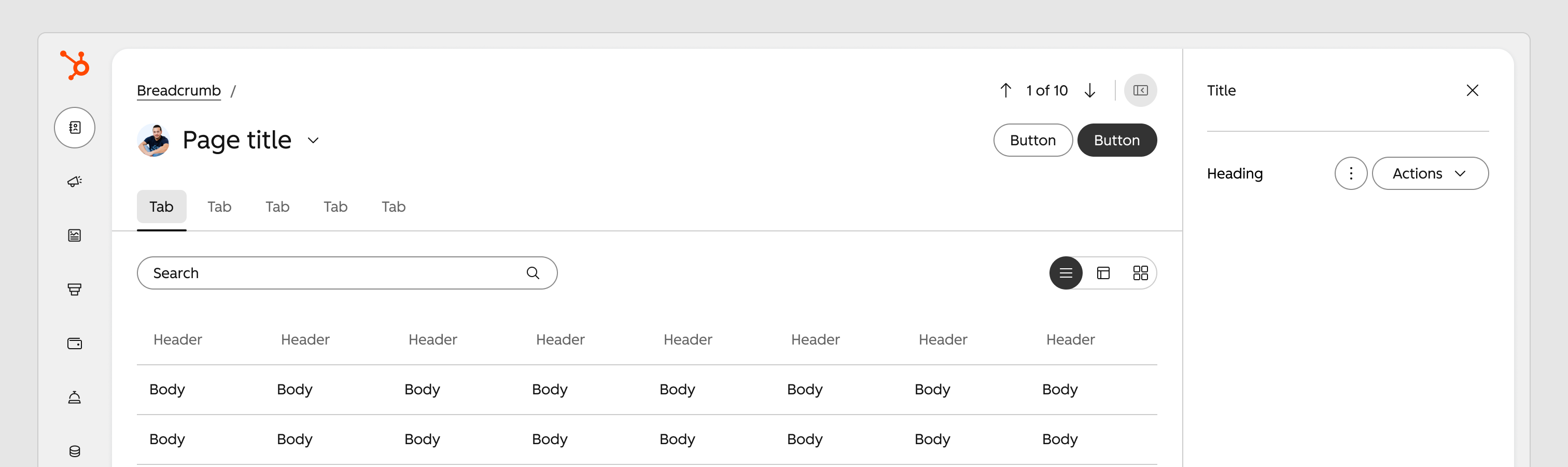
Modernizing a Legacy Design System
HubSpot, 2025–26
HubSpot outgrew its systems and processes, and lacked the critical infrastructure to scale. To keep up with growing number of new players entering the upmarket space, HubSpot invested in an effort to modernize the design system.
Role
Staff Product Designer
Team
3 Principal Designers
5 Product Designers
2 Design Technologists
1 Principal Content Designer
The Problem
Designing and building products at HubSpot is harder than it should be. A legacy system became stagnant and teams started creating their own libraries and custom patterns. Without a centralized system, inconsistencies have led to a huge cognitive load for users. And, what about our builders?
The Canvas “core library” has over 400 components in it. There are also countless local libraries built on different API contracts, so teams can’t share local components. The lack of structure as created a lot of pain for our builders.
400+
Number of components in the Canvas core library.
100+
Number of local libraries that have been build over the years.
450+
Number of product teams the HubSpot design system serves.
My Role and Contribution
I had a key role in modernizing our components to incorporate accessible interactions and industry standard behaviors and contributed to our new design language in the areas of grid, shape language and spacing.
I also took a lead role in the enablement of our product designers — supporting a huge migration effort while also addressing pattern guidance.
Phase 1: Transitioning
Creating a Temporary Theme
For many strategic reasons, including technical limitations and time sensitivity, the first course of action was to build a backward-compatible design system that teams would be required to migrate to. This transitional theme would provide a “glow up” for HubSpot at InBound 2025. It was mostly color updates that met WCAG color contrast ratios— it couldn’t include anything that might cause layout refactors or breaking changes.
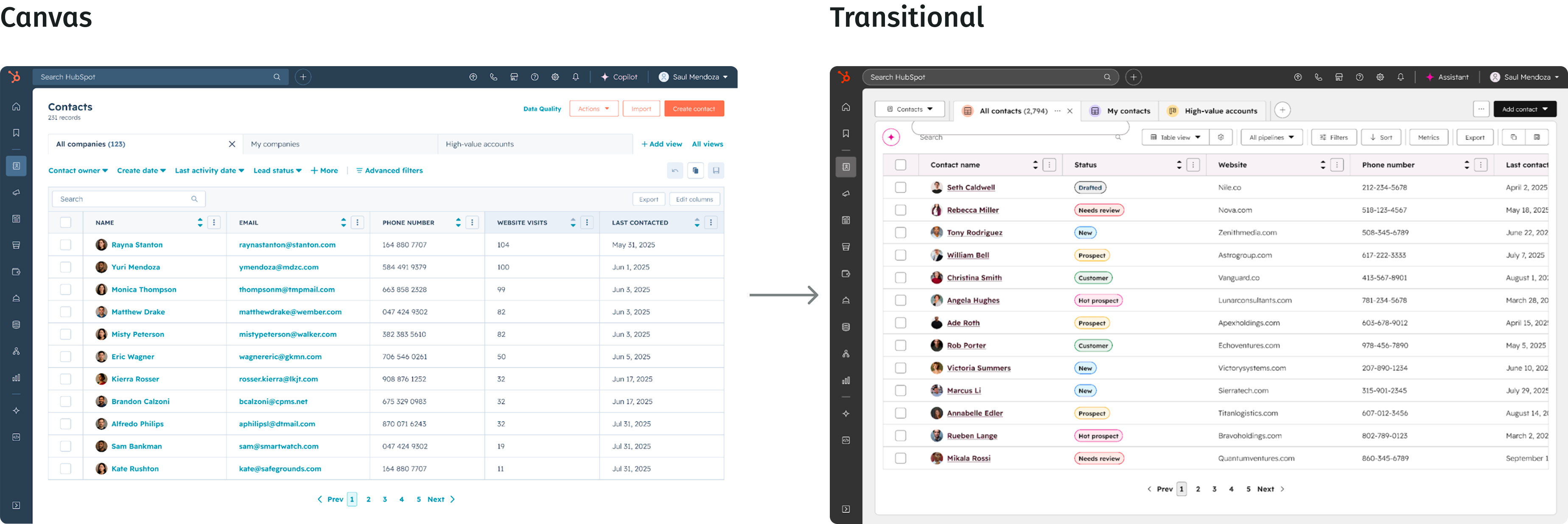
The transitional library enabled designers and developers to migrate to a new tokenized system without any breaking changes.
New Transitional Components
I co-led the creation of the transitional Figma library with one other designer on the team. Our goal was to create a library of tokenized components with Canvas feature parity. This work would enable automated migration in 2025.
There was an exception. At the time, the Canvas table was deemed too complex for auto-migration. Instead, I led the design of a modernized Data Grid to replace our table component.
I led the creation of a Figma transitional component library. Designers could utilize the library to view designs in both themes.
Enabling Builders for Migration
The Canvas library was built in Figma before many features we use today existed. Designers to create bad habits of detaching components to manipulate them to fit their needs. The new library was built with the most advanced (at the time) Figma architecture, but the design team at HubSpot lacked fluency in Figma.
Once the library was published, it was critical that product designers keep components attached so they could get the most out of our tokenized system. I recorded Loom tutorials to enable our designers to become fluent in how the new components were built.
Activating Leadership and Engineers
Designers were enabled. I co-led an effort to activate managers — showing them what would be expected in migration. When migration started, I co-led a design effort to support not only the design org, but also engineers both across teams on the design systems team. We created documentation and other resources to fill gaps we observed in support. I became an expert in all things tokens, Trellis, and backward Canvas compatibility.
As teams were asked to begin the visual quality assurance (VQA) process, I partnered with an engineer on our team to create a video walking through the entire process.
New Theme Unveiled
Well, we did it. In the end, it was a lot of squeeze for minimal juice. But, the big win is that we were able to introduce a new semantic token architecture to ensure that future migrations could be much easier on product teams.
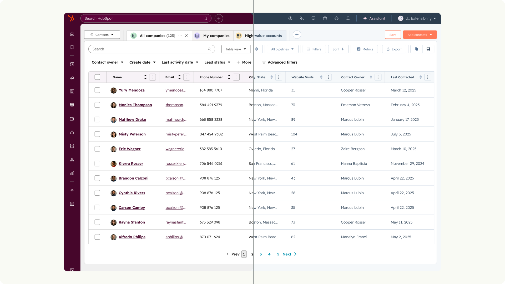
The new theme was unveiled at HubSpot’s InBound 2025 conference.
Phase 2: Modernization
Lifting the Guardrails
Round 2. Now that a tokenized transitional library was in place, we were able to get real about about greenfield modernization — without backwards compatibility.
In Q4 we would deliver one production-ready UI screen built with the modernized design language for initial internal use. Focusing on a single screen helped us define our first modernization pilot and keep the work manageable.
One key decision was to leverage a headless open-source library to accelerate development and it allowed us to focus on pattern work. Undocumented patterns have long caused the biggest headaches for designers. Take a deeper look at how I tackled defining chips, tags and badges.
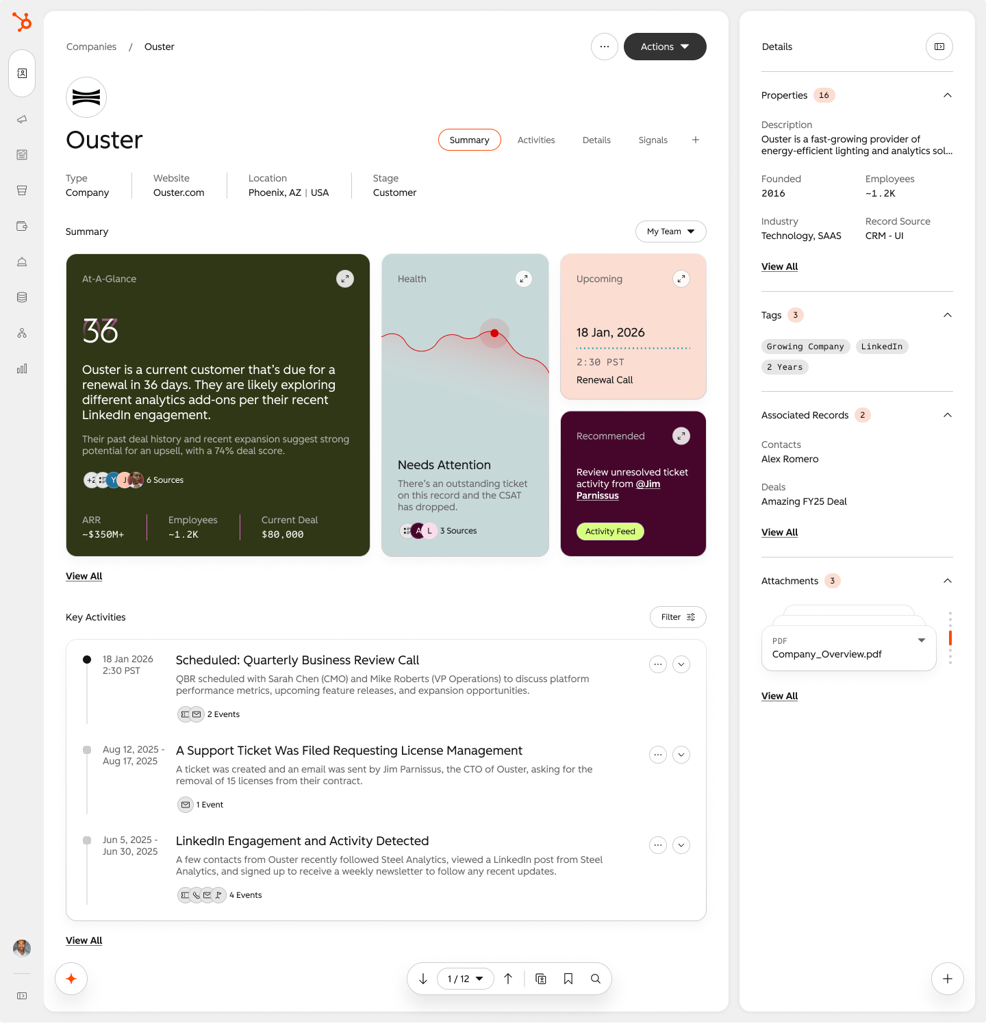
Creating a modernized system began with a single screen. While one squad worked on a modern design language, I worked on identifying and creating the components and patterns needed.
My Role and Contribution
I was given an ambitious Q4 goal and the work that I did on building out pattern guidance with the chips, tags and badges but also other components like page headers and tabs contributed to successfully delivering one production-ready UI screen built with the modernized design language for initial internal use.
I also contributed to several Tiger Teams that clearly defined our new design language, which enabled us to meet the goal. I was part of the grid team, the shape language team and spacing and sizing.
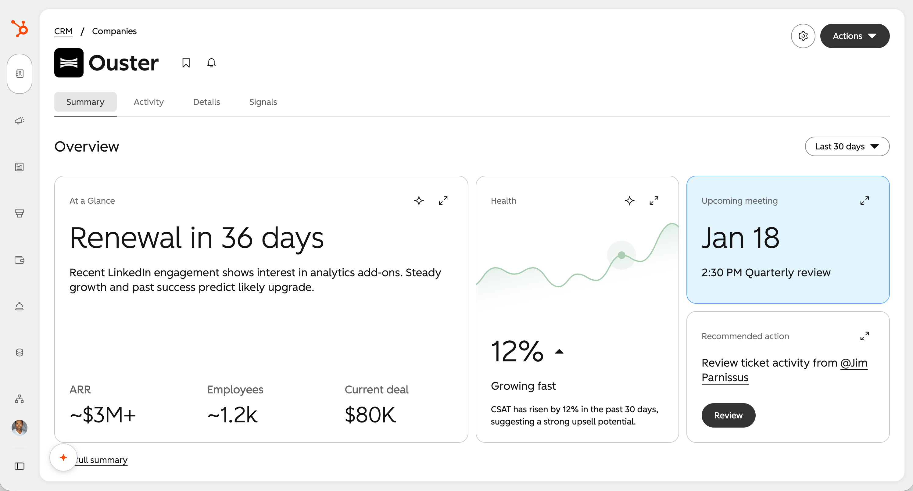
Within a single quarter, the team was able to complete one screen with coded components, a 3-tier token system and a new grid.
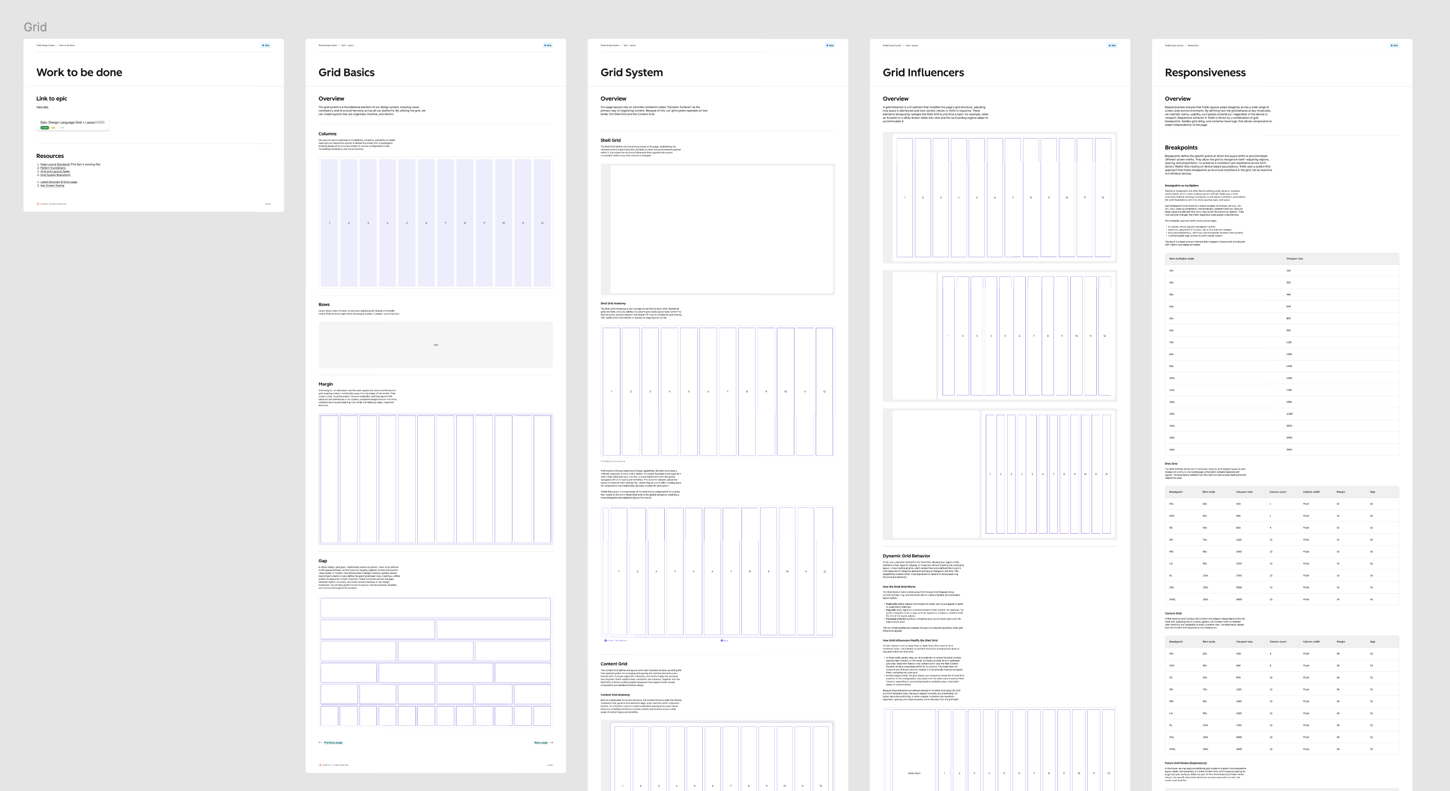
We formed tiger teams to push our design language foundational elements across the finish line. I worked with two other designers to test and finalize our grid.

Modernizing a Legacy Design System
HubSpot, 2025–26
HubSpot outgrew its systems and processes, and lacked the critical infrastructure to scale. To keep up with growing number of new players entering the upmarket space, HubSpot invested in an effort to modernize the design system.
Role
Staff Product Designer
Team
3 Principal Designers
5 Product Designers
2 Design Technologists
1 Principal Content Designer
The Problem
Designing and building products at HubSpot is harder than it should be. A legacy system became stagnant and teams started creating their own libraries and custom patterns. Without a centralized system, inconsistencies have led to a huge cognitive load for users. And, what about our builders?
The Canvas “core library” has over 400 components in it. There are also countless local libraries built on different API contracts, so teams can’t share local components. The lack of structure as created a lot of pain for our builders.
400+
Number of components in the Canvas core library.
100+
Number of local libraries that have been build over the years.
450+
Number of product teams the HubSpot design system serves.
My Role and Contribution
I had a key role in modernizing our components to incorporate accessible interactions and industry standard behaviors and contributed to our new design language in the areas of grid, shape language and spacing.
I also took a lead role in the enablement of our product designers — supporting a huge migration effort while also addressing pattern guidance.
Phase 1: Transitioning
Creating a Temporary Theme
For many strategic reasons, including technical limitations and time sensitivity, the first course of action was to build a backward-compatible design system that teams would be required to migrate to. This transitional theme would provide a “glow up” for HubSpot at InBound 2025. It was mostly color updates that met WCAG color contrast ratios— it couldn’t include anything that might cause layout refactors or breaking changes.
The transitional library enabled designers and developers to migrate to a new tokenized system without any breaking changes.
New Transitional Components
I co-led the creation of the transitional Figma library with one other designer on the team. Our goal was to create a library of tokenized components with Canvas feature parity. This work would enable automated migration in 2025.
There was an exception. At the time, the Canvas table was deemed too complex for auto-migration. Instead, I led the design of a modernized Data Grid to replace our table component.
I led the creation of a Figma transitional component library. Designers could utilize the library to view designs in both themes.
Enabling Builders for Migration
The Canvas library was built in Figma before many features we use today existed. Designers to create bad habits of detaching components to manipulate them to fit their needs. The new library was built with the most advanced (at the time) Figma architecture, but the design team at HubSpot lacked fluency in Figma.
Once the library was published, it was critical that product designers keep components attached so they could get the most out of our tokenized system. I recorded Loom tutorials to enable our designers to become fluent in how the new components were built.
Activating Leadership and Engineers
Designers were enabled. I co-led an effort to activate managers — showing them what would be expected in migration. When migration started, I co-led a design effort to support not only the design org, but also engineers both across teams on the design systems team. We created documentation and other resources to fill gaps we observed in support. I became an expert in all things tokens, Trellis, and backward Canvas compatibility.
As teams were asked to begin the visual quality assurance (VQA) process, I partnered with an engineer on our team to create a video walking through the entire process.
New Theme Unveiled
Well, we did it. In the end, it was a lot of squeeze for minimal juice. But, the big win is that we were able to introduce a new semantic token architecture to ensure that future migrations could be much easier on product teams.
The new theme was unveiled at HubSpot’s InBound 2025 conference.
Phase 2: Modernization
Lifting the Guardrails
Round 2. Now that a tokenized transitional library was in place, we were able to get real about about greenfield modernization — without backwards compatibility.
In Q4 we would deliver one production-ready UI screen built with the modernized design language for initial internal use. Focusing on a single screen helped us define our first modernization pilot and keep the work manageable.
One key decision was to leverage a headless open-source library to accelerate development and it allowed us to focus on pattern work. Undocumented patterns have long caused the biggest headaches for designers. Take a deeper look at how I tackled defining chips, tags and badges.
Creating a modernized system began with a single screen. While one squad worked on a modern design language, I worked on identifying and creating the components and patterns needed.
My Role and Contribution
I was given an ambitious Q4 goal and the work that I did on building out pattern guidance with the chips, tags and badges but also other components like page headers and tabs contributed to successfully delivering one production-ready UI screen built with the modernized design language for initial internal use.
I also contributed to several Tiger Teams that clearly defined our new design language, which enabled us to meet the goal. I was part of the grid team, the shape language team and spacing and sizing.
Within a single quarter, the team was able to complete one screen with coded components, a 3-tier token system and a new grid.
We formed tiger teams to push our design language foundational elements across the finish line. I worked with two other designers to test and finalize our grid.
Modernizing a Legacy Design System
HubSpot, 2025–26
HubSpot outgrew its systems and processes, and lacked the critical infrastructure to scale. To keep up with growing number of new players entering the upmarket space, HubSpot invested in an effort to modernize the design system.
Role
Staff Product Designer
Team
3 Principal Designers
5 Product Designers
2 Design Technologists
1 Principal Content Designer
The Problem
Designing and building products at HubSpot is harder than it should be. A legacy system became stagnant and teams started creating their own libraries and custom patterns. Without a centralized system, inconsistencies have led to a huge cognitive load for users. And, what about our builders?
The Canvas “core library” has over 400 components in it. There are also countless local libraries built on different API contracts, so teams can’t share local components. The lack of structure as created a lot of pain for our builders.
400+
Number of components in the Canvas core library.
100+
Number of local libraries that have been build over the years.
450+
Number of product teams the HubSpot design system serves.
My Role and Contribution
I had a key role in modernizing our components to incorporate accessible interactions and industry standard behaviors and contributed to our new design language in the areas of grid, shape language and spacing.
I also took a lead role in the enablement of our product designers — supporting a huge migration effort while also addressing pattern guidance.
Phase 1: Transitioning
Creating a Temporary Theme
For many strategic reasons, including technical limitations and time sensitivity, the first course of action was to build a backward-compatible design system that teams would be required to migrate to. This transitional theme would provide a “glow up” for HubSpot at InBound 2025. It was mostly color updates that met WCAG color contrast ratios— it couldn’t include anything that might cause layout refactors or breaking changes.
The transitional library enabled designers and developers to migrate to a new tokenized system without any breaking changes.
New Transitional Components
I co-led the creation of the transitional Figma library with one other designer on the team. Our goal was to create a library of tokenized components with Canvas feature parity. This work would enable automated migration in 2025.
There was an exception. At the time, the Canvas table was deemed too complex for auto-migration. Instead, I led the design of a modernized Data Grid to replace our table component.
I led the creation of a Figma transitional component library. Designers could utilize the library to view designs in both themes.
Enabling Builders for Migration
The Canvas library was built in Figma before many features we use today existed. Designers to create bad habits of detaching components to manipulate them to fit their needs. The new library was built with the most advanced (at the time) Figma architecture, but the design team at HubSpot lacked fluency in Figma.
Once the library was published, it was critical that product designers keep components attached so they could get the most out of our tokenized system. I recorded Loom tutorials to enable our designers to become fluent in how the new components were built.
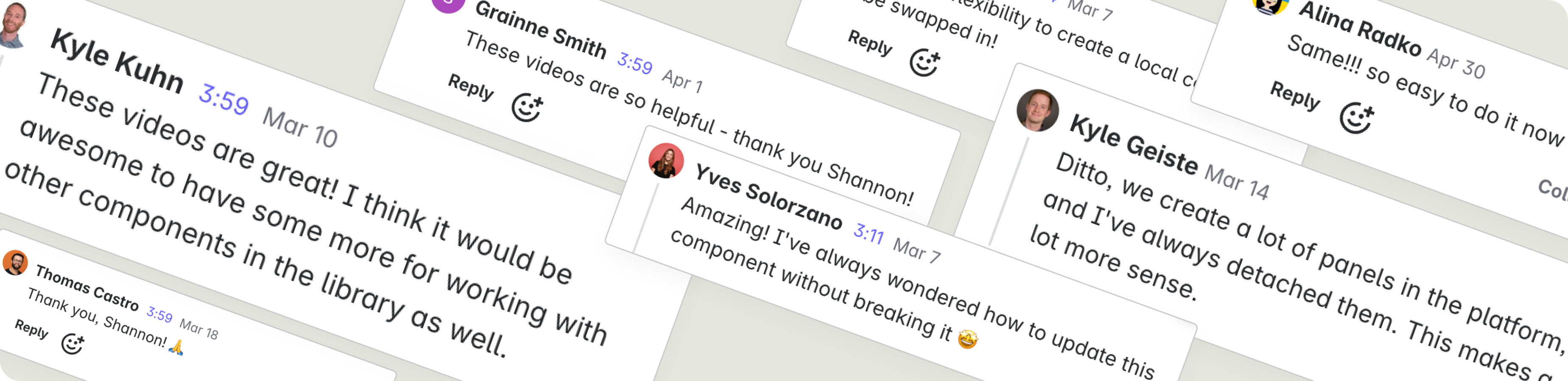
My Loom videos enabling designers to use the new library were a big hit.
Activating Leadership and Engineers
Designers were enabled. I co-led an effort to activate managers — showing them what would be expected in migration. When migration started, I co-led a design effort to support not only the design org, but also engineers both across teams on the design systems team. We created documentation and other resources to fill gaps we observed in support. I became an expert in all things tokens, Trellis, and backward Canvas compatibility.
As teams were asked to begin the visual quality assurance (VQA) process, I partnered with an engineer on our team to create a video walking through the entire process.
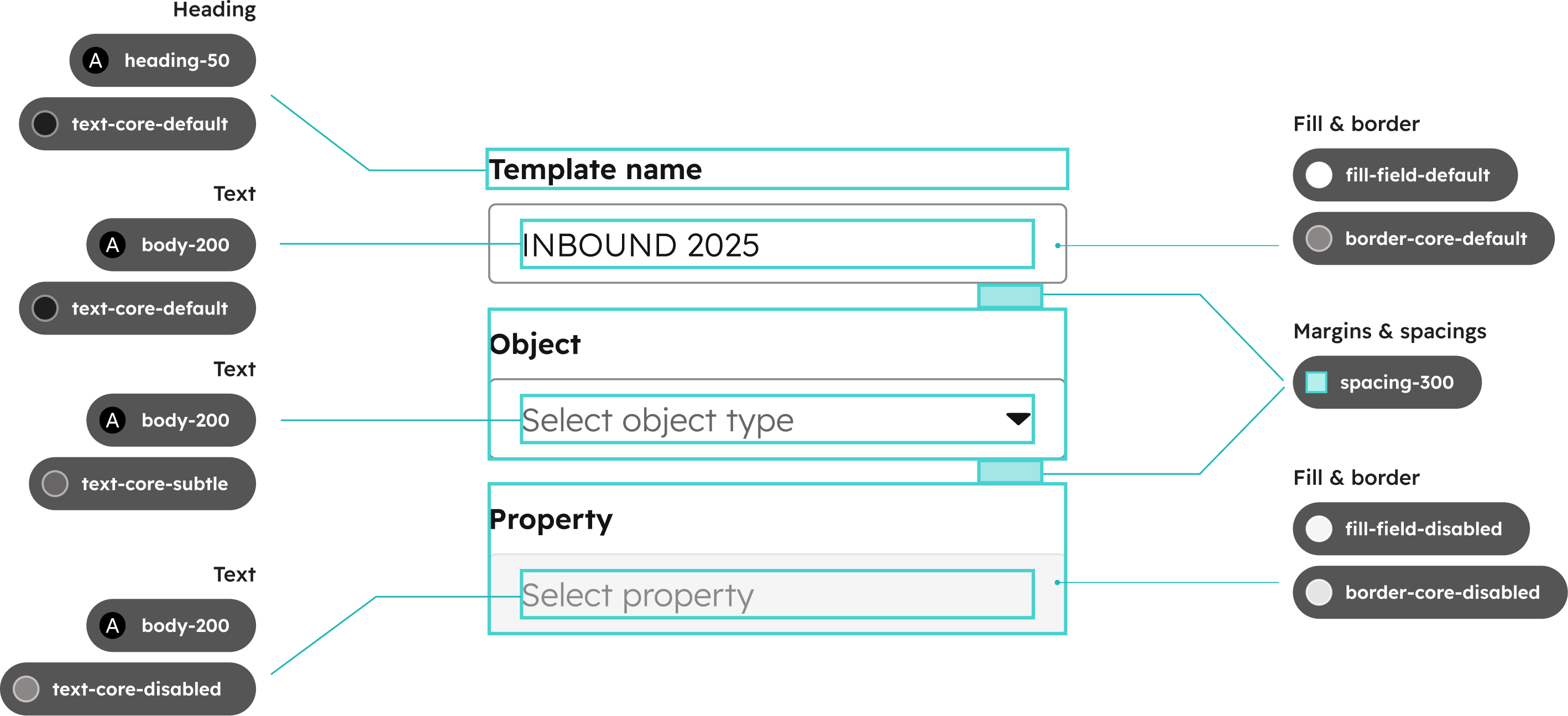
I created diagrams and documentation to help guide users through the migration to the transitional theme.
New Theme Unveiled
Well, we did it. In the end, it was a lot of squeeze for minimal juice. But, the big win is that we were able to introduce a new semantic token architecture to ensure that future migrations could be much easier on product teams.
The new theme was unveiled at HubSpot’s InBound 2025 conference.
Phase 2: Modernization
Lifting the Guardrails
Round 2. Now that a tokenized transitional library was in place, we were able to get real about about greenfield modernization — without backwards compatibility.
In Q4 we would deliver one production-ready UI screen built with the modernized design language for initial internal use. Focusing on a single screen helped us define our first modernization pilot and keep the work manageable.
One key decision was to leverage a headless open-source library to accelerate development and it allowed us to focus on pattern work. Undocumented patterns have long caused the biggest headaches for designers. Take a deeper look at how I tackled defining chips, tags and badges.
Creating a modernized system began with a single screen. While one squad worked on a modern design language, I worked on identifying and creating the components and patterns needed.
My Role and Contribution
I was given an ambitious Q4 goal and the work that I did on building out pattern guidance with the chips, tags and badges but also other components like page headers and tabs contributed to successfully delivering one production-ready UI screen built with the modernized design language for initial internal use.
I also contributed to several Tiger Teams that clearly defined our new design language, which enabled us to meet the goal. I was part of the grid team, the shape language team and spacing and sizing.
Within a single quarter, the team was able to complete one screen with coded components, a 3-tier token system and a new grid.
We formed tiger teams to push our design language foundational elements across the finish line. I worked with two other designers to test and finalize our grid.